预处理图像至关重要
无论是由您手动完成,还是以某种方式通过GD库即时完成,您绝对至少需要拍摄您声明要接收的图像...
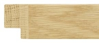
...并裁剪并拧紧它以使其像这样干净(边缘周围没有空白区域,并且去除了凹口/切口):
然后你有一个可以实际使用的图像。
否则,纯CSS / JAVASCRIPT
注意:我不是在这里做javascript。它将用于动态设置元素大小,如 html 中所示。
通常情况下,我会使用一定数量的和':after'伪元素来保持html不那么混乱,但是由于您需要动态调整框架的大小,那么我们需要使用许多嵌套的div元素来设置对某些元素至关重要的宽度和高度的动态样式(如果javascript可以访问这些元素或者不需要动态大小调整,其中一些仍然是伪元素)。:beforediv
注意:到目前为止,我只在Chrome和Firefox中进行了测试。真正旧的浏览器肯定会失败得很惨。
/* implementation of framing */
.frameit {
/* width and height must be set dynamically by javascript see html */
position: relative;
box-sizing: border-box;
overflow: hidden;
padding: 20px; /* at least border size */
}
.frameit:before,
.frameit:after,
.frameit .sides > div,
.frameit .corner > div {
position: absolute;
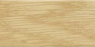
background-image: url(http://i.stack.imgur.com/vAgqj.jpg);
background-size: 100% 20px; /* 100% and border size */
height: 20px; /* equal to border width of frameit div */
}
.frameit:before {
content: '';
top: 0;
left: 0;
right: 0;
}
.frameit:after {
content: '';
bottom: 0;
left: 0;
right: 0;
}
.frameit .sides {
position: absolute;
top: 0;
right: 0;
bottom: 0;
left: 0;
z-index: 1;
}
.frameit .sides > div {
/* width must be set dynamically by javascript see html */
height: 20px;
}
.frameit .sides > div:first-child {
top: 0;
left: 20px; /* border width */
transform-origin: 0 0;
transform: rotate(90deg);
}
.frameit .sides > div:last-child {
bottom: 0;
right: 20px; /* border width */
transform-origin: 100% 100%;
transform: rotate(90deg);
}
.frameit .sides ~ .corner { /* all corners */
position: absolute;
z-index: 2;
width: 29px; /* square root of ((border-width squared) x 2) round up */
height: 29px; /* match width */
overflow: hidden;
}
.frameit .TL {
top: 0;
left: 0;
transform-origin: 0 0;
transform: rotate(-45deg);
}
.frameit .TL > div {
top: inherit;
left: inherit;
transform-origin: inherit;
transform: rotate(45deg);
}
.frameit .TR {
top: 0;
right: 0;
transform-origin: 100% 0;
transform: rotate(45deg);
}
.frameit .TR > div {
top: 0;
right: 0;
transform-origin: 100% 0;
transform: rotate(-45deg);
}
.frameit .BR {
bottom: 0;
right: 0;
transform-origin: 100% 100%;
transform: rotate(-45deg);
}
.frameit .BR > div {
bottom: inherit;
right: inherit;
transform-origin: inherit;
transform: rotate(45deg);
}
.frameit .BL {
bottom: 0;
left: 0;
transform-origin: 0 100%;
transform: rotate(45deg);
}
.frameit .BL > div {
bottom: inherit;
left: inherit;
transform-origin: inherit;
transform: rotate(-45deg);
}
/* Optional shading to help define the joint */
.frameit .sides > div:first-child:before,
.frameit .sides > div:last-child:before {
content: '';
position: absolute;
top: 0;
right: 0;
left: 0;
bottom: 0;
background-color: rgba(0,0,0,.07);
}
<div class="frameit" style="width: 200px; height: 300px;">
   <!-- top and bottom and overall container
        width and height assumed to be set by javacript by user
   -->
   <div class="sides">
     <!-- left and right sides
        widths of the children are equal to HEIGHT of container and are
        assumed to be set by javacript by user
     -->
     <div style="width: 300px;"></div>
     <div style="width: 300px;"></div>
   </div>
   <div class="TL corner"><!-- top left bevel --><div style="width: 200px;"></div></div>
   <div class="TR corner"><!-- top right bevel --><div style="width: 200px;"></div></div>
   <div class="BR corner"><!-- bottom right bevel --><div style="width: 200px;"></div></div>
   <div class="BL corner"><!-- bottom left bevel --><div style="width: 200px;"></div></div>
</div>